
Hello Friends,
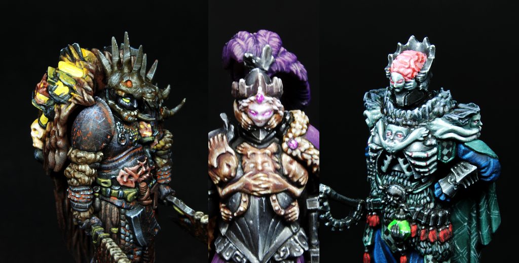
this third part of the article will focus on the decisions and painting of the 3 nemesis from the core set: Butcher, King’s Man and The Hand.
I will try go into detail as much as possible and post big sized pictures to help better see the paintjob.
These three miniatures are very important (and annoying) in the game, plus the sculpts are ultra clean and detailed: i think they deserv some carefully planning before starting the paintjob and i talked extensively with the customer to decide bases and color scheme.
Another important thing is the assembly: i have the (bad) habit of assembling everything before starting to paint but sometimes it’s necessary to paint the pieces separately. Otherwise, it could -and will- be difficult to reach certain parts of the miniature.
This is the case, for example, of The Hand: if you glue everything, the sword and right arm will make it hard to paint the inside of the cloack.
Think carefully about it before starting the job: some prefer to assemble everything anyway, some doesn’t.
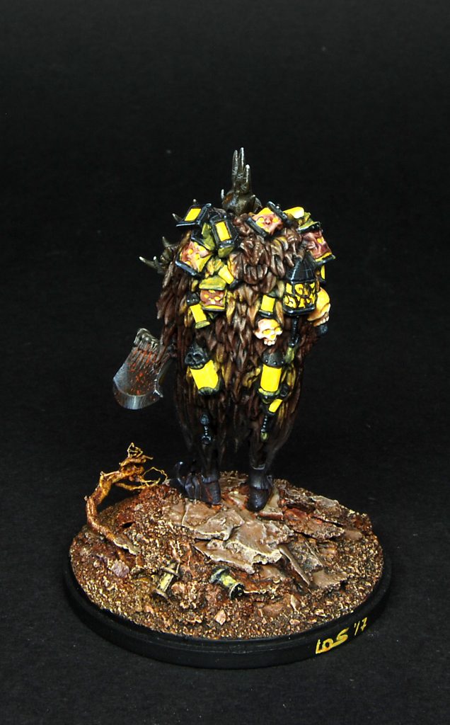
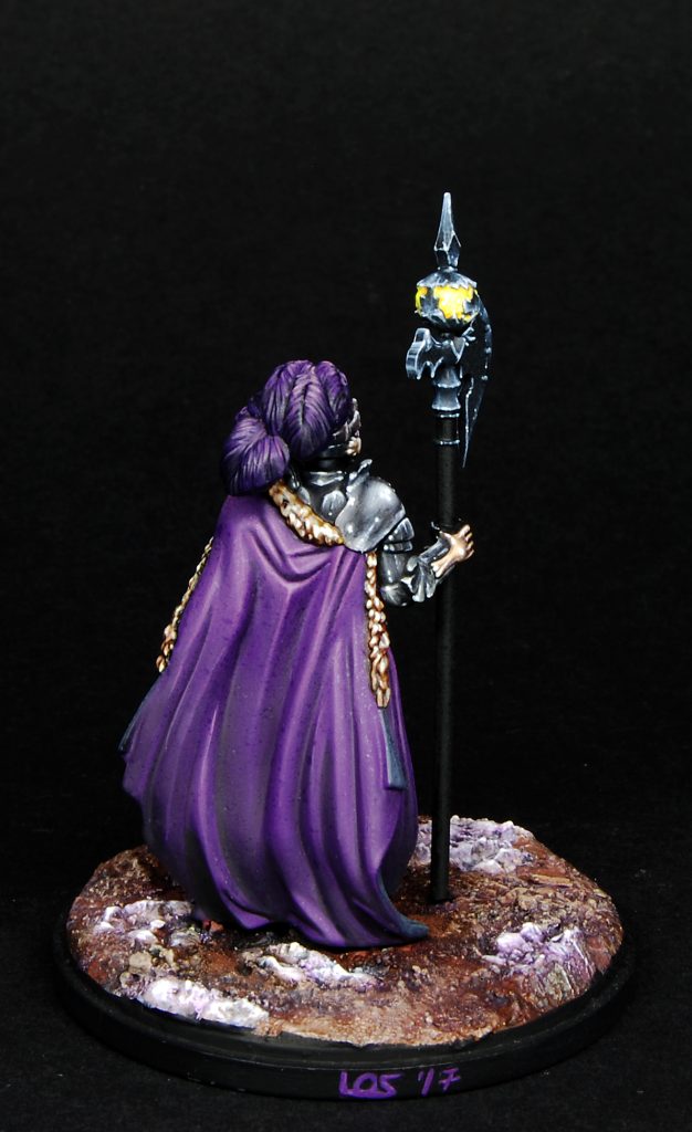
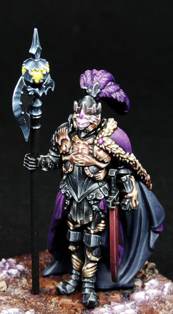
Let’s now begin talking about The Butcher.
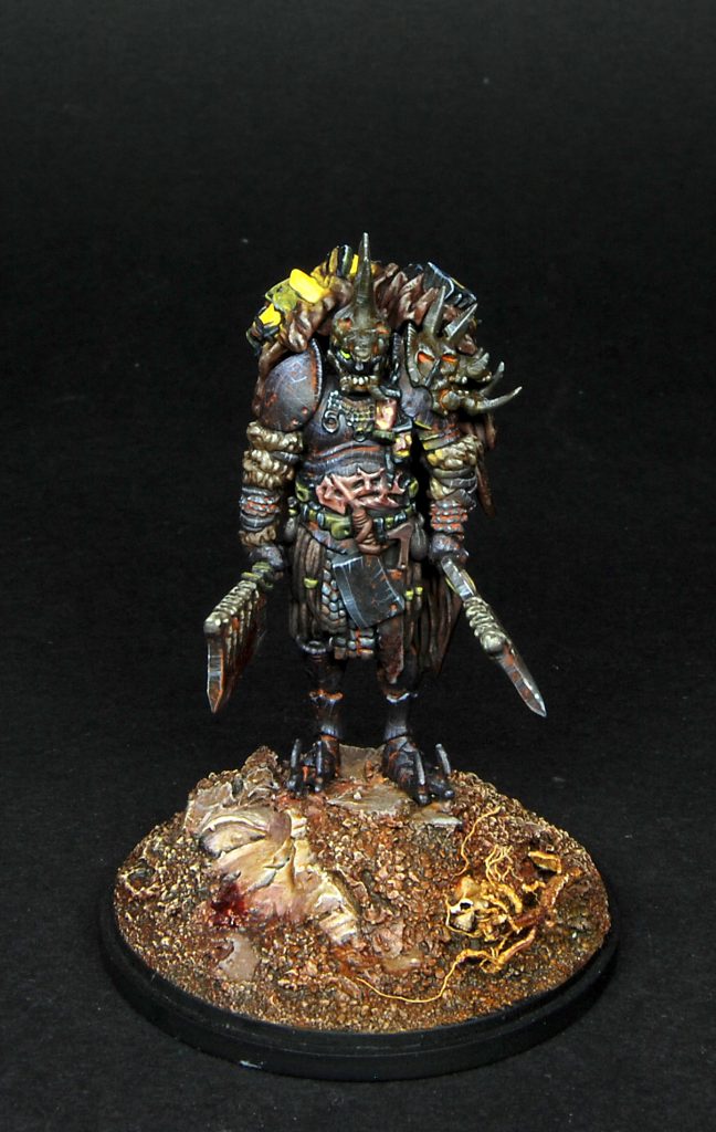
Customer requested him to be painted in dark colors with extra care for the armor: the armor itself had to be painted like an heavy and dull mass of iron.
So, no shiny nmm for him.
I started by taking inspiration from the official art and immediately my favourite couple of colors, purple and orange, came to mind.
In the specific, these three colors from VMC were used extensively through the paintjob: Amarantha Red, Royal Purple and Ofxord Blue(a greyish purple).
The armor was basecoated with a purpleish grey (mix of black, purples and grey), and i decided to avoid a reflecting look to keep the dull look: i simply highlited adding tons of thin scratches in a controlled way, concentrating the final lightspost on the shoulder and on the left part of the breastplate.
One of the tricks used when painting a miniature in a nocturnal setting is putting pale blue in the lights, and so, for the highlights i used a VMC Pale Greyblue: this color was used to highlight every part, it has a strong azure component in it and helps giving a “night” feel to the paintjob.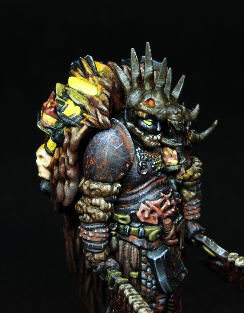
Armor was shaded with glazes of diluted black and i added rust simply mixing an orange pigment with water, diluted in the recesses and stippled here and there.
Weapons received almost the same treatment, but avoiding the purple in the basecoat and going a little further with the lights: i wanted them to look old, but also somewhat still sharp, so i added very small lightspots as a final touch.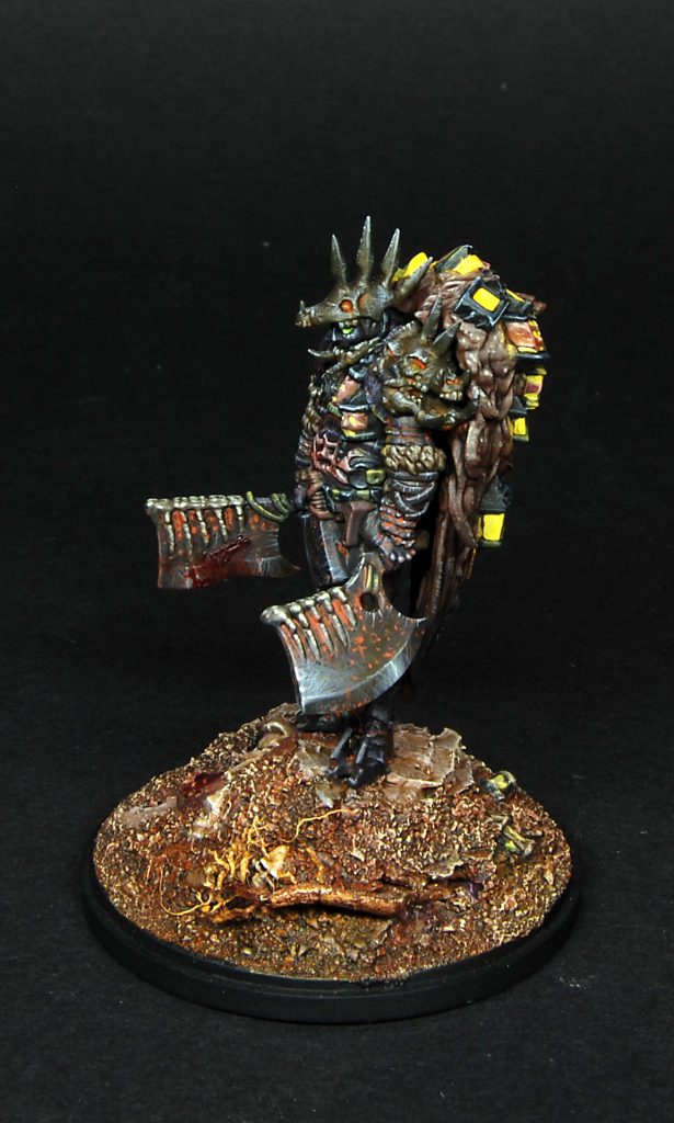 Bronze parts like helm and pauldron where basecoated with an orangish brown, then washed several times with Agrax eartshade and diluted VMC Amarantha Red(beware cause this stuff is very tinting), than scratched like the armor.
At this point i painted the fur on the arms: basecoat was a mix of brown and buff shaded many times with Agrax and Druuchi Violet, than carefully stippled up to VMC Pale Greyblue.
The leather straps were basecoated with a mix of VMC Dark Yellow and purple, then simply edge highlighted two times adding the usual VMC Pale Greyblue: some thin scratches here and there and they’re done!
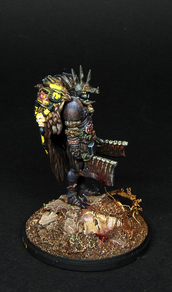
The fur cape was basecoated with some eerie mix of purple, orange and brown and shaded many times with Druuchi Violet, concentrating it towards the bottom.
Here also was used carefully stippling to bring back the color first, than to raise the lights to the upper parts of the sculpt, concentrating on the hunchback: adding a pale color around the lanterns would have helped me later with the osl, which i’m really no good at painting on dark surfaces.
Speaking about it, i think i could have done better with the osl and will surely push it more next time i will paint a Butcher: anyway, first of all i painted every lantern white and then used diluted yellow fluo pigment( i spoke about them in part 2) to paint over it. The same method was used to paint the eyes of the Butcher, and the result is a very powerful color that contrast a lot with the dark overall scheme.
Finally i painted the base, a mix of rocks(to raise the butcher height),sand, some dying lanterns, an evil root and a stone face from Scibor
Everything was painted in pale brown, than worked with the “wax in, wax off” method: washes of diluted VMC Amarantha red and Druuchi Violet alternated to drybrush with orange and buff until i reached VMC Pale Greyblue.
The root itself was given more orange and. As a final touch, a bit of blood was added on the cleavers and ground using Tamiya Clear Red mixed with some black.
All in all the model resulted a bit too much dark, it can be appreciated more if looked at under daylight.
I think this is all regarding the Butcher, and i can move on to the next nemesis: King’s Man.

The request for this guy was: absolutely no red cloack, an overall regal look and shining armor.
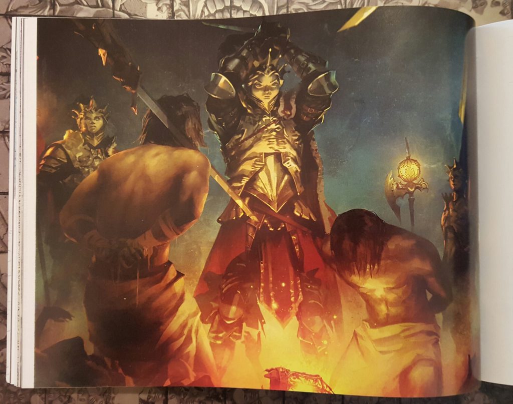
So, i took a look at this illustration and decided to went with polished steel armor and purple cape, a no brainer if you ask me.
Basically the paintjob was NMM on all the steel parts, a simple dark grey shaded with black and highligthed with white and a bit of yellow to give it a warmer tone: unfortunately, the yellow in the mix was not enough and isn’t visible in picture neither in real life.
While painting the armor i made sure to respect the “rule of contrast” and tried as much as possible to place a shadow zone near an highlight zone, as you can see on the breastplate and on the knees.
Lights placement is very important when you paint metal, be it NMM or true metal, in my opinion more than a perfect blending: flawless blendings are also necessary to reach “perfect” look but, if you put lights in an inconsistent way, the paintjob simply won’t work.
The only “steel” part where i changed the basecoat mix was the halberd:
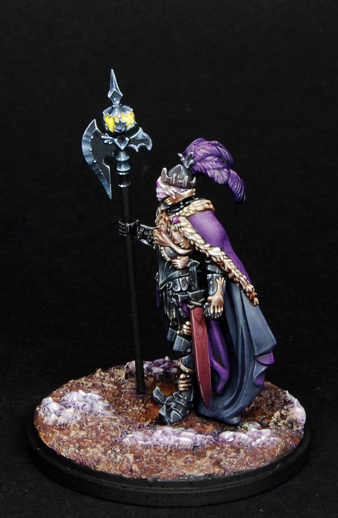
As you can see i added more blue to the mix but the rest of the work is the same. On the blade i went for the sharp look and tried to simulate the reflections of true metal, while on the lantern i used again the fluo yellow painted on the Butcher’s lanters and eyes: this time i avoided painting the osl all over the armor, i really couldn’t afford it since i was working on time schedule, but i’d like to try it on my next King’s Man.
On the black parts you can also spot some stains: this is thanks to the sealer i had to spray on the models before shipping them to the customer; i’ve never been able to avoid that (in fact i spray the sealer only under precise request from the clients), and feel free to comment about it if you have some good suggestions.
Ok, so the purple parts were simply basecoated with VMC Royal Purple, adding black to the shadows and white-yellow to the lights. Here the important thing was to paint them as smooth as possibile and respect the volumes in a realistic way. The guy’s wearing a quality cape, so no rough blending for him.
In fact, i repainted the mantle twice until i was satisfied with it. There are dots on it also. Ugh.
Plumes where painted the same way, just adding more black towards the shadow and trying also to place max light near max shadow.
The fur was basecoated buff and washed with Druuchi Violet a couple of times before adding volume again with buff and adding white little by little, this time avoiding stippling, and concentrating on the upper parts.
Inside of the cloack was painted with a mix of grey, blue and purple, shaded and highligted in the same way.
This part is very difficult to paint if you assemble everything in one go, like i did.
The scabbard was painted with a mix of grey, red and purple and also shaded adding black while highlighted with small quantities of white towards the upper part, and a final edge highlight to give it more contrast.
I added a very simple freehand on its side, barely visible on the pic.
The gold NMM decorations were painted first with a mix of GW Averland Sunset and little VMC Royal Purple.
After that i worked in the same way of the armor, adding more purple and a small amount of black in the shadows and adding white-yellow in the highlights.
I have to say i’m not completely happy with it: with hindsight i should have added more contrast and maybe look more at reference pictures of ornate armor to copy the reflections of metal. This is because it was difficult to paint NMM on shapes like hands and faces, and they look duller when compared to the steel armor.
Also, the final color looks a bit too similar to the fur decorating the cape, something i will definitely change in future paintjobs.
Final parts i painted were the crown, made with a mix of brown-purple and then usually painted in NMM style, and the goth-helm that i basecoated with a mix of purple and buff, shaded with purple and highlighted up to pure white.
The eyes were first carefully washed with diluted magenta and then i painted the pupil with pure white: this gives the idea of evil, glowing energy around them.
Base was created adding crushed pieces of the “face” inserts and adding real soil and sand, then painted with a mix of browns shaded with violet washes and highlighted with drybrush of orange and buff.
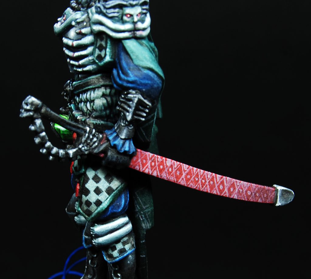
For The Hand i received a totally different request: the customer left me freedom on the color scheme but wanted him colorful, because he envisioned this miniature like an evil jester. After a little thinking i decided to take inspiration from the showdown itself and paint him using only red,green and blue: the colours of his auras.

Again, i stupidly glued everything before starting the paintjob, and this gave me problems painting legs and other internal parts.
However, i started painting the sabaton where i followed the same technique used on the King’s Man armor: this goes the same for every armor part, so i won’t cover it anymore.
The trousers and sleeves were given a coat from VMC Flat Blue: sometimes this color is very shiny, in that case i add Tamiya x-21 Flat base, a very useful medium if you have to paint flat surfaces like fabrics and your colors tends to satin.
The blue was simply shaded with black and highlighted with small quantities of white, and i kept this trend to all the parts to avoid adding other colors to the RGB scheme.
I then started the chainmal that, unfortunately, in the pics looks just grey: in real it’s more greenish, and in fact was basecoated with a mix of black and VMC Flat Green, washed several times with GW Biel-tan Green and Nuln Oil before bringing back the color with addition of green and white.
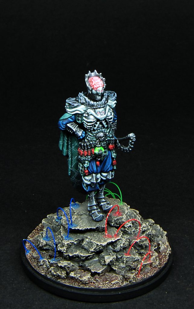
After that i painted the belt and the red tassels: when painting red it’s always best to avoid(or keeping to the minimum) adding white or other colors in the highlights.
Some reds are very powerful but quickly lose intensity if you add other colors to the mix, so many painters shade the red parts normally and leave the pure red for the highlights.
Here the tassels are very small, however i painted them with Molotow Red (this colors are worth a try), carefully shading with black in the recesses and leaving pure red on the upper parts.
At this point most of the torso and legs were painted, so i moved to the cape: both sides received a mix of VMC Flat Green + Black + a small drop of VMC Flat Blue.
I started painting the inside, adding shadows and lights with the usual black/white addition, concentrating on the folds and trying to give zenithal light.
As you can see, the inside received a small freehand made of squares and lines but, due to having glued everything together, i wasn’t able to be very precise. Think about it if you want to decorate the cape of your Hand.
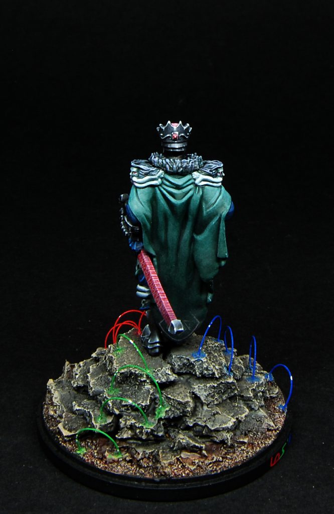
The backside also received a small pattern on the bottom; at first i wanted to draw a check pattern on it, but i quickly dismissed this idea because the risk to turn the miniature from “jester” to “buffoon” was too high.
I resorted to use the check pattern on the small plates adorning the armor.
In the above pictures you can see a close up: it was the first time i tried this kind of drawing and you can see some parts are not perfect, but the overall look is fine, especially at medium distance.
They where painted using black and white with a small green mixed in both; after that, i shaded the plates with VMC Black Glaze, a transparent black.
The same black was used to shade the scabbard, painted with red and decorated with a simple freehand.
Take care when using this glaze, it has to be well diluted, otherwise you risk leaving stripes and/or dots.
So, final details where the armor’s “organic” decorations and the brain.
![]()
The latter was painted pink, washed a couple times with red in the recesses, than painted back pink with the addition of some pure white dots to simulate the wet look; i’ve also added a coat of gloss medium to reinforce this.
Decorations where painted with a grey-green and gently washed with GW Biel-tan Green before highlighting adding white. I love their look, the design of this miniature is genial.
To give quantity contrast, i painted red in the eyes and beetween the phalanges. This way the red pops extremely well against the greenish “background” of the decorations.
Now, as you can see from the pics, the base is has some strange details: i decided to add some sort of “energy wave” to represent the three auras radiating from the Hand.
The base itself is very simple, cork pieces glued in 4 concentric layers to give height to the guy, sand, and a rough paintjob consisting in neutral grey, brown washes and some gentle grey/khaki drybrush.
Than i drilled holes in the cork to put the “auras”.
To create the arcs i used thin fishing pole cut to pieces and VERY carefully glued into the holes. This stuff it’s small and transparent, easy to lost the pieces, so i suggest working with hobby pliers and a lot of patience.
To create the “auras” i paid attention to leave circa 120° between them, to divide the base in equal sections, then i painted them in primary RGB and put some pure white dots here and there. Done!
I think this is all about the three nemesis and i wrote more than i thought at first.
I hope this long reading has been useful and interesting but, if you have question, do not hesitate to contact me HERE or comment this post.
If you like my works you can also follow them on my Facebook Page.
See you for part 4: Phoenix and her friends!
Lorenzo